The Poster Knows: Hidden Clues in Movie Marketing Art That Studios Buried in Plain Sight
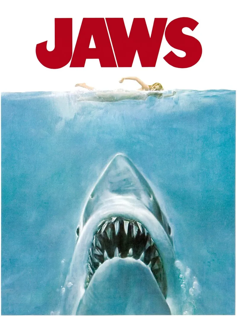
Photo: Roger Kastel, Public domain, via Wikimedia Commons
A movie poster is supposed to sell a feeling. Big face, bold title, maybe an explosion or two. You glance at it, maybe save it to your camera roll, and move on. But some of the most interesting storytelling happening in Hollywood right now isn't on screen — it's on the one-sheet hanging outside your local multiplex.
Film marketing teams, production designers, and sometimes the directors themselves use promotional artwork as a second layer of the narrative. Color choices, compositional geometry, character positioning, even the specific shade of sky in the background — none of it is random. Once you learn the visual language, you can't unsee it.
Here's your field guide.
Color Is the First Language
Before your brain processes a single image, it processes color. Marketing teams know this, and they use it with surgical precision.
Orange and teal is the most overused combo in blockbuster posters for a reason — it's a complementary contrast that photographs well and reads as "cinematic" to a mass audience. But when a poster breaks away from that formula, it's usually deliberate.
Pale, desaturated blues signal isolation, psychological distance, or moral ambiguity. Think about how many thriller and prestige drama posters lean into washed-out blue-gray palettes. It's not just an aesthetic trend — it's an emotional primer. By the time you're sitting in the theater, you've already been conditioned to feel a certain kind of unease.
Red that bleeds into darkness at the edges of a poster is almost always a violence or obsession signal. It shows up in horror, obviously, but also in films about passion, revenge, or characters who are about to make a catastrophic decision. The gradient matters — red that fades to black is different from red that fades to gold. The former suggests destruction; the latter, sacrifice or transformation.
Yellow, especially a sickly or oversaturated yellow, tends to appear in films dealing with paranoia, corruption, or moral rot. It's the color of wrong things that look right on the surface.
What Character Positioning Actually Tells You
Who stands where on a movie poster is almost never accidental.
The character with their back turned is one of the most loaded visual choices in promotional art. It signals mystery, but more specifically, it signals that this character is either the one the audience should be wary of, or the one whose interiority is the whole point of the film. Either way, the image is telling you: don't think you know this person yet.
Height and scale communicate power dynamics. In ensemble posters, whoever is largest or highest on the image is usually the narrative center — or the threat. When a villain is depicted at the same scale as the hero, that's often a deliberate hint that the power balance in the film will be more even than expected.
Eye contact with the viewer is an invitation, but averted eyes are a warning. A character staring directly out of the poster is pulling you in, making you complicit. A character looking away — especially looking down — is already in the middle of something you're about to walk into.
Physical proximity between characters in a poster frequently maps to emotional proximity in the film. Two characters who appear inches apart in the art but whose bodies are angled away from each other? Expect tension, unresolved history, or a relationship that looks close but isn't.
The Geometry Hidden in Composition
This is where it gets genuinely nerdy, and also where the most interesting clues live.
Classic compositional triangles — where three key visual elements form a triangle across the poster — are a stability signal. The film is probably built on a three-person dynamic, and the triangle tells you which relationships are load-bearing.
Broken symmetry is a spoiler. Posters that are almost symmetrical but have one element that's slightly off — a figure positioned a few degrees outside the center, a shadow that falls wrong, a color that doesn't match its mirror — are usually flagging that the apparent order of the story will fracture. The visual disruption previews the narrative one.
Negative space (what's not shown) is consistently underread by audiences. A poster with a character surrounded by empty space isn't just making a stylistic choice — it's telling you this person is isolated, or that the world of the film is one where they're alone against something much larger. Negative space in marketing art maps directly to themes of smallness, vulnerability, or existential scale.
Reflection imagery — a character shown in a mirror, in water, in glass — almost always indicates a duality theme. Two versions of a character, a hidden identity, a false self. If a poster shows a reflection that doesn't quite match the source, that's not a production error. That's a thesis statement.
Real Examples Worth Going Back and Looking At
Without naming names in ways that would age badly, here are patterns that have appeared repeatedly in major releases:
-
A franchise sequel poster where the hero's costume color had shifted from warm tones to cool ones — previewing a character arc toward moral ambiguity that wasn't confirmed until the third act.
-
An indie horror release where the poster featured a family portrait with one member's eyes reflecting a different light source than everyone else's — a literal visual hint at the film's central reveal.
-
A superhero film's teaser poster where the villain was placed above the hero in the composition for the first time in the franchise's marketing history — correctly telegraphing that this entry would be the one where the villain actually wins.
-
A drama's poster that used a warm, golden palette but with a single cold-lit window in the background — the one element that pointed toward the film's devastating final scene.
Go back to the promotional art for films you've already seen. You'll find the clues you missed.
The Intentional Versus the Accidental
Here's the honest caveat: not everything is intentional.
Marketing departments work under insane time pressure. Posters get made by committee, revised seventeen times, and sometimes the "hidden meaning" is just a happy accident of a rushed design process. Part of the fun — and the discipline — of reading movie posters like this is learning to distinguish between deliberate craft and coincidental pattern.
The tells for intentionality are usually: consistency across multiple pieces of marketing material (if the same motif appears in the poster, the trailer thumbnail, and the theatrical banner, it's probably on purpose), and alignment with what the director has publicly discussed about the film's themes.
The tells for coincidence are: elements that don't connect to anything in the final film, or visual choices that contradict the tone of the movie you actually saw.
Start Looking Differently
The next time you see a movie poster — on a billboard, on your streaming homepage, in a social media ad — give it ten extra seconds. Ask what the colors are priming you to feel. Ask why the characters are positioned where they are. Ask what's missing from the frame.
You're not looking for conspiracy. You're learning a visual language that's been spoken at you your whole life without anyone explaining the grammar.
At Termerj, that's exactly the kind of decoding we live for. The message was always there. You just needed to know what to look for.